Tarantula Hill Brewing Co.
Years of brand stewardship on draft.
Details
Tarantula Hill Brewing Co. needed a cohesive brand ecosystem that could strengthen its hyper-local community in Thousand Oaks while scaling across Southern California. As Creative Director, I led a years-long brand evolution — transforming scattered touchpoints into one unified experience that cultivates local loyalty and carries that authentic community feeling into new markets, from the taproom to the shelf.
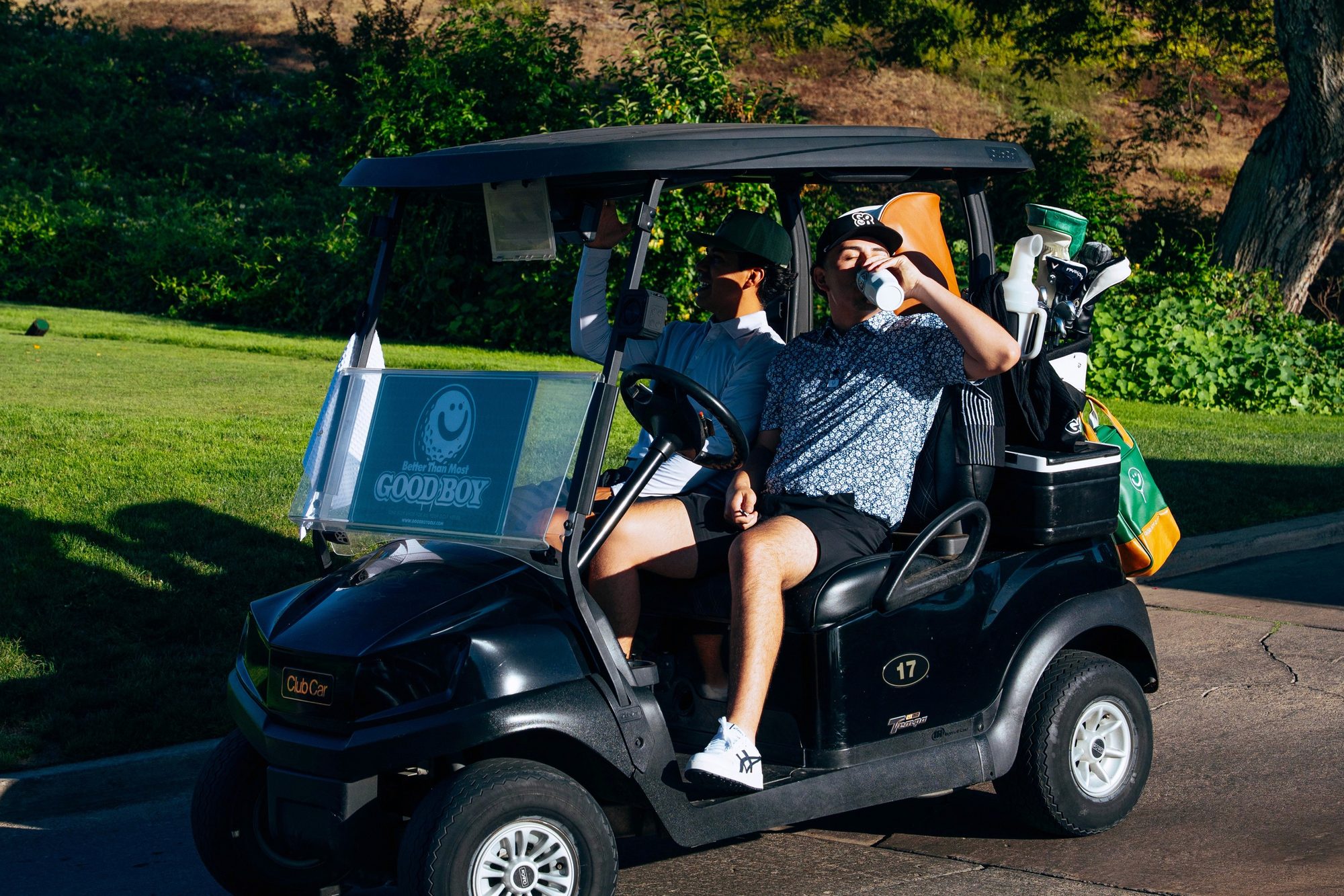
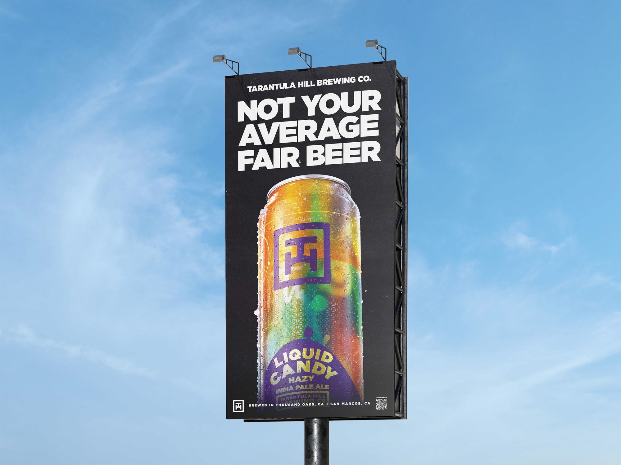
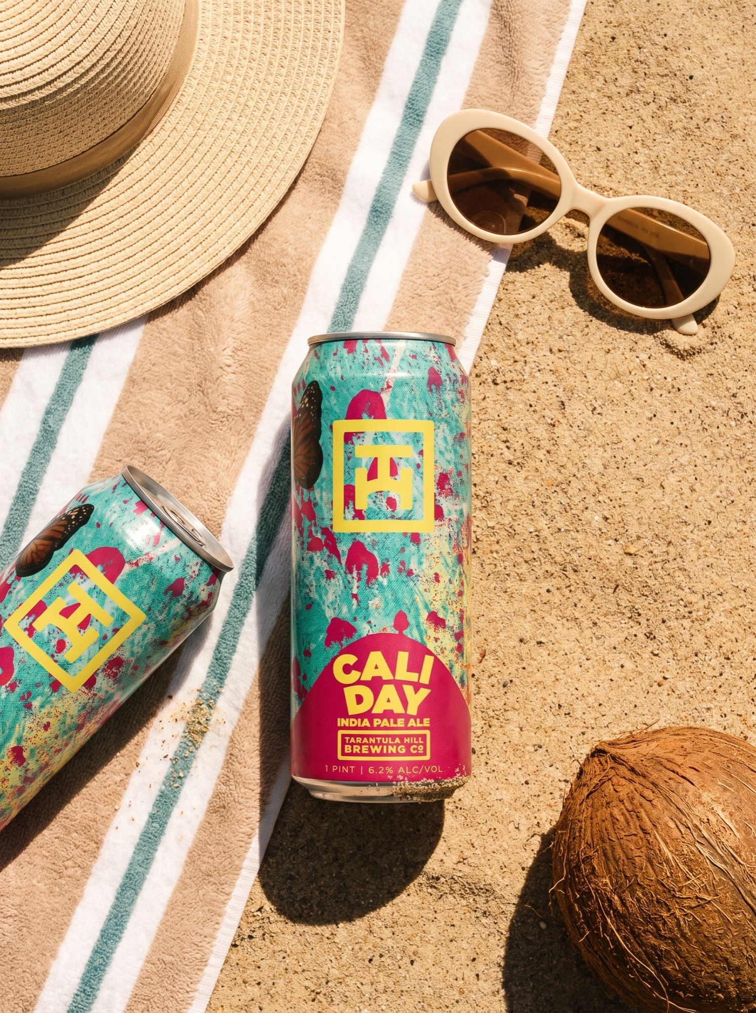
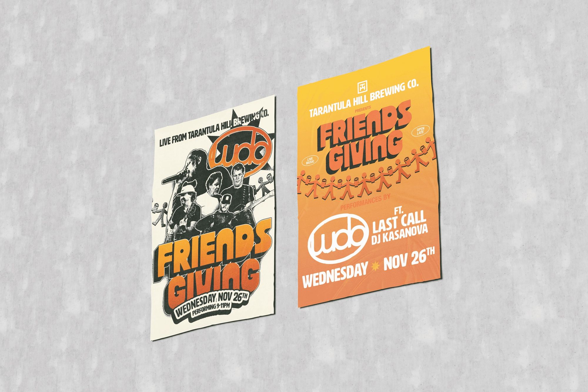
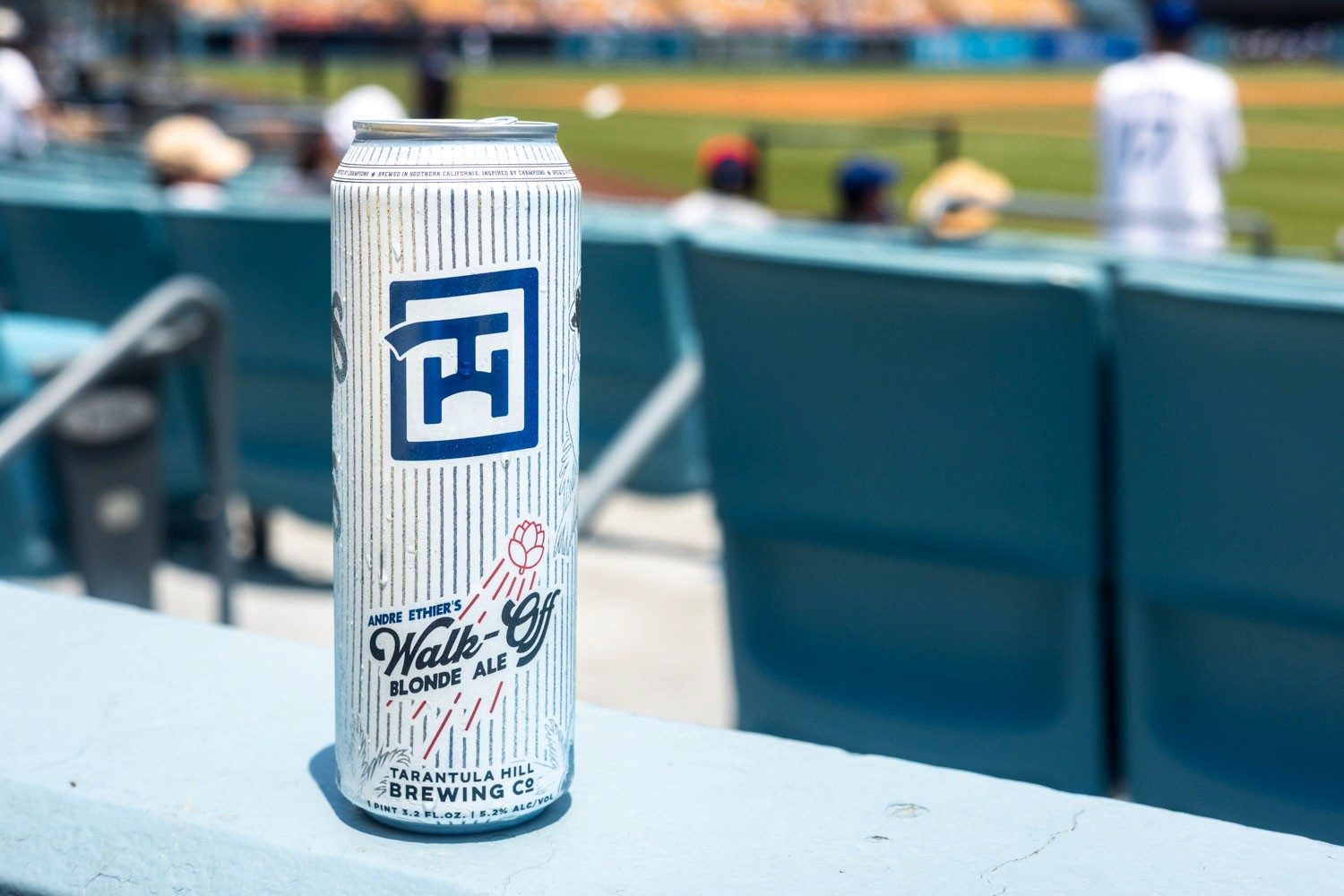
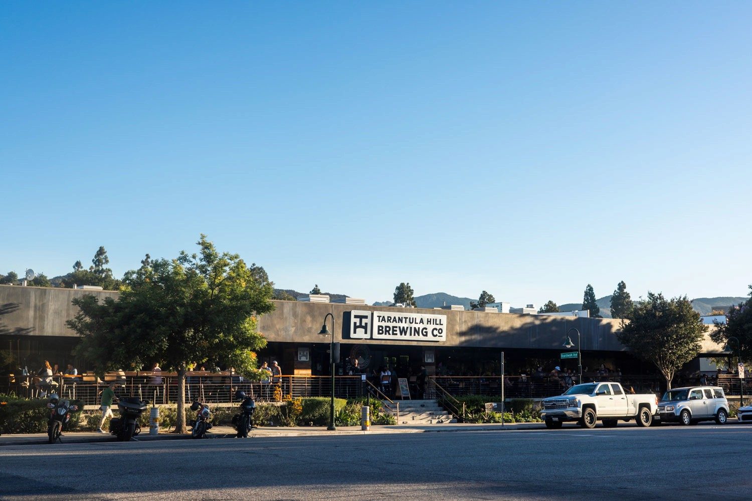
I designed all of the brewery's packaging and kept the identity and guidelines that hold it together. I coordinated campaigns with the rest of the team, set the deadlines and followed every creative asset through to delivery — mine and the team's alike. Beyond the can, I created the on-site marketing for events and the in-store signage and menus, and carried the same system onto the web, so the brand reads as one voice wherever people meet it.
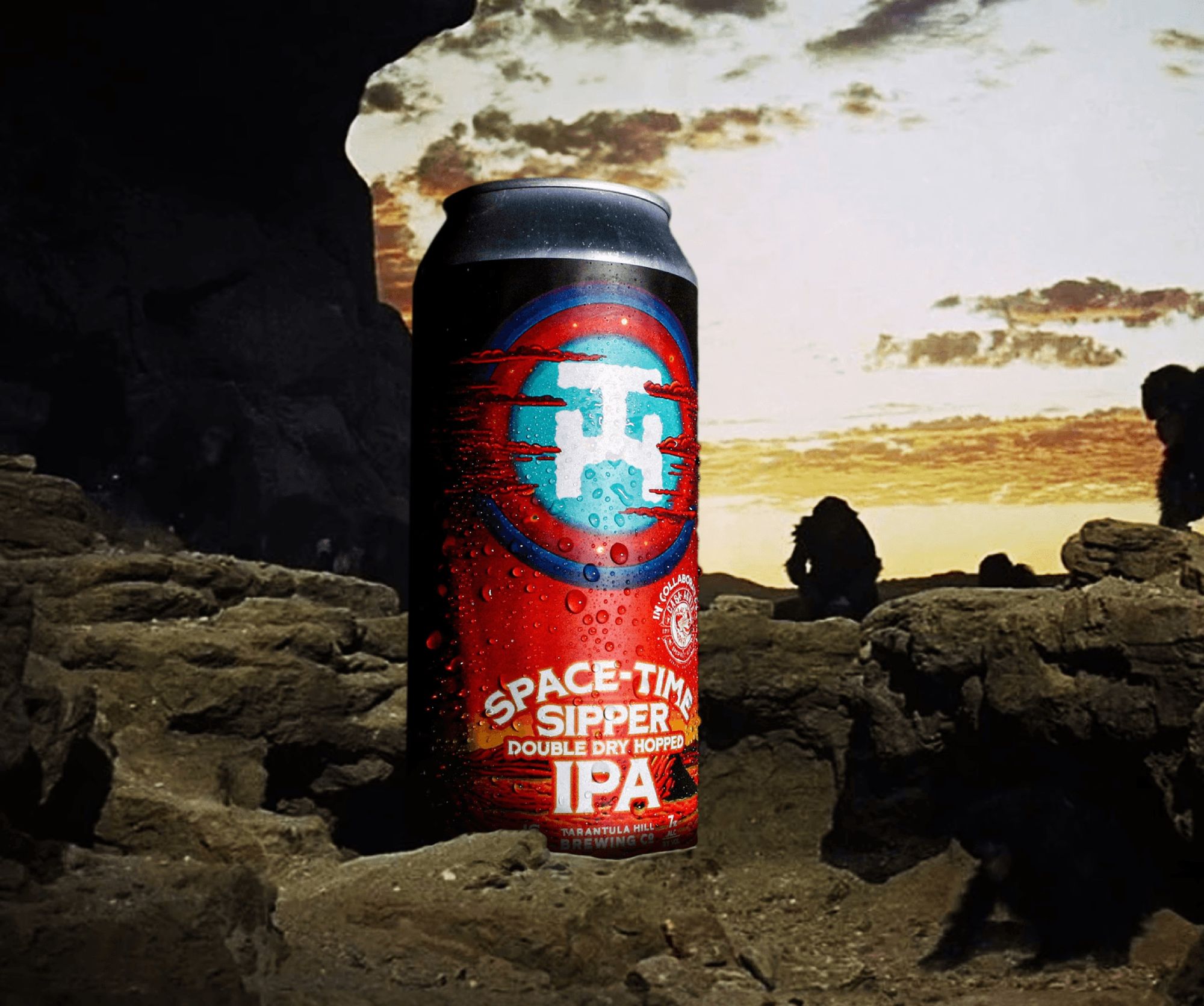
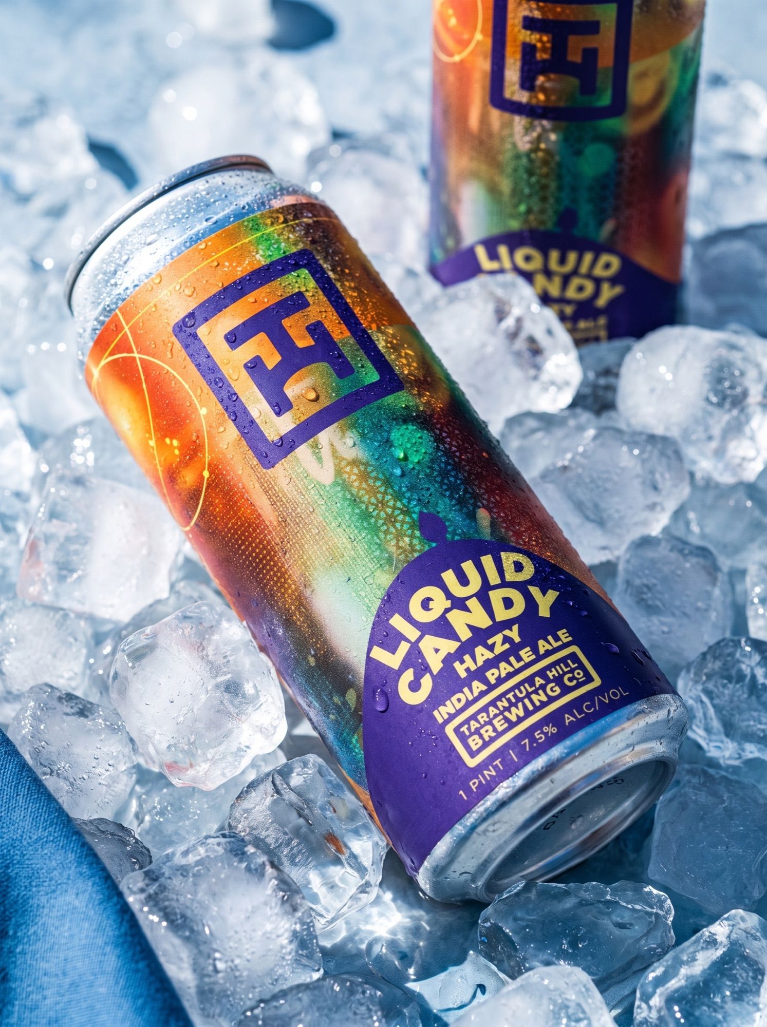
I led a creative team of three — a social media manager, a videographer/editor, and a photographer/content creator — plus a partnered agency's design team, running weekly production and shoot direction. Together we shipped 20+ seasonal and limited releases a year, with packaging designed within TTB and state alcohol labeling requirements, and sell sheets and retail tools that connected the brand work to distribution.
Services
*Creative Direction *Marketing *Packaging *Campaigns *Events *Signage *Web
Year
2021 — 2026
Visit site ↗Chapter 01
The house brand
One system from the taproom to the shelf.
The core identity — mark, type, color and the rules that hold them together — carried across cans, taproom signage, menus, seasonal releases and the web, so every touchpoint reads as the same brewery.
What I did
Packaging design, brand identity and guidelines, campaign coordination with the team, deadlines and creative follow-through, on-site event marketing, in-store signage, menus and web.
*Identity *Packaging *Events *Signage *Menus *Web
Chapter 02
Seltzer Series
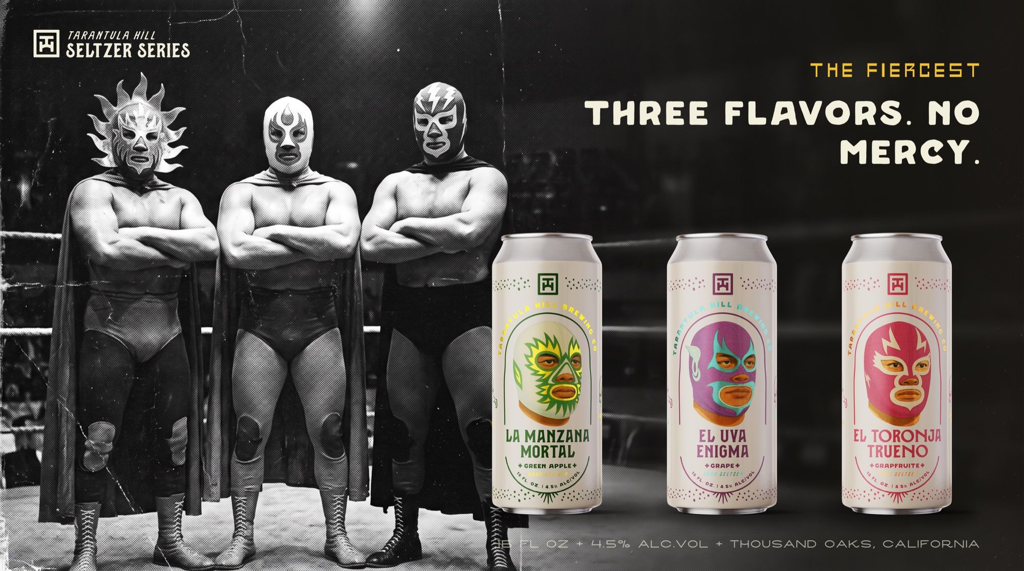
Three flavors. No mercy.
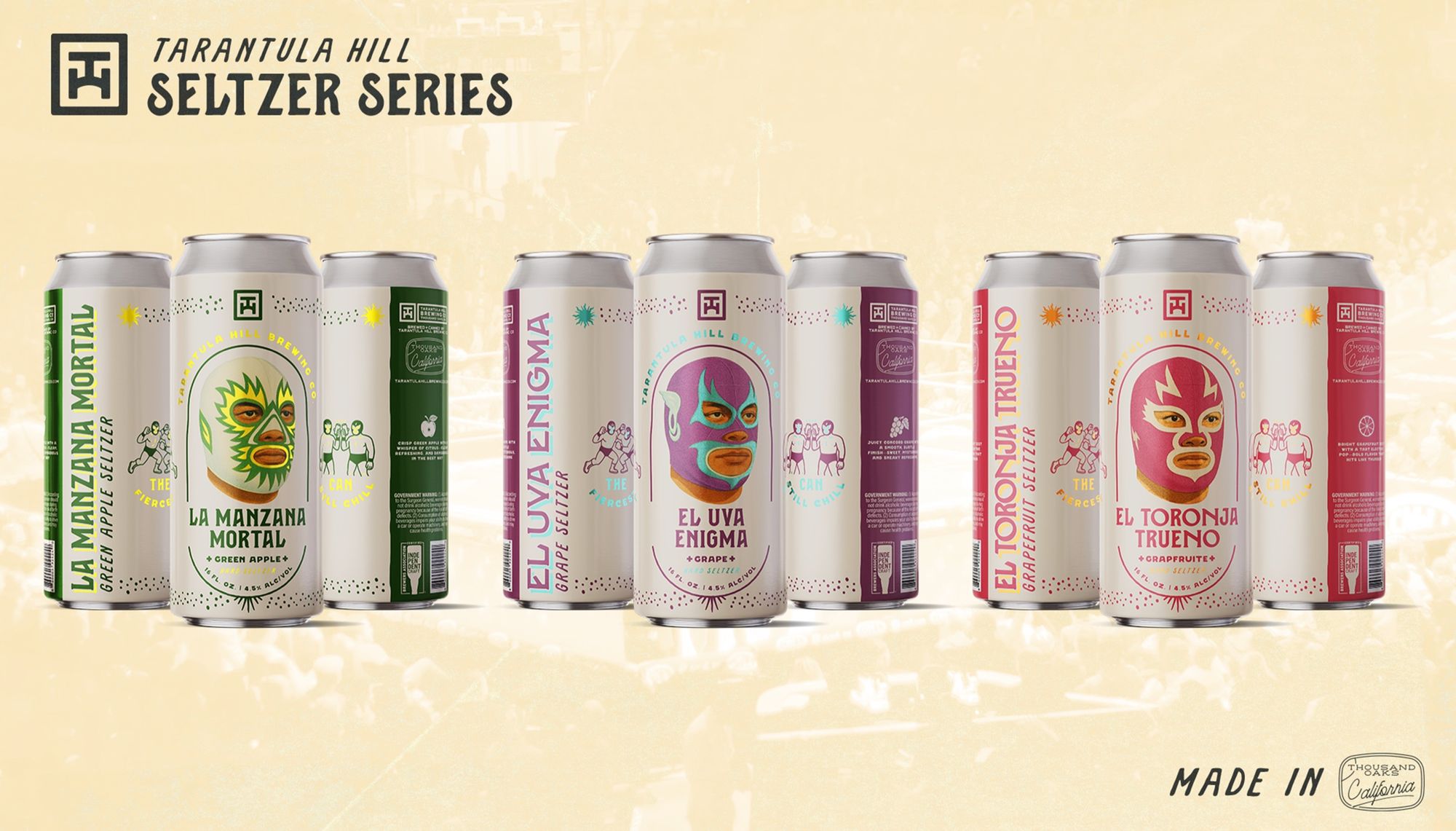
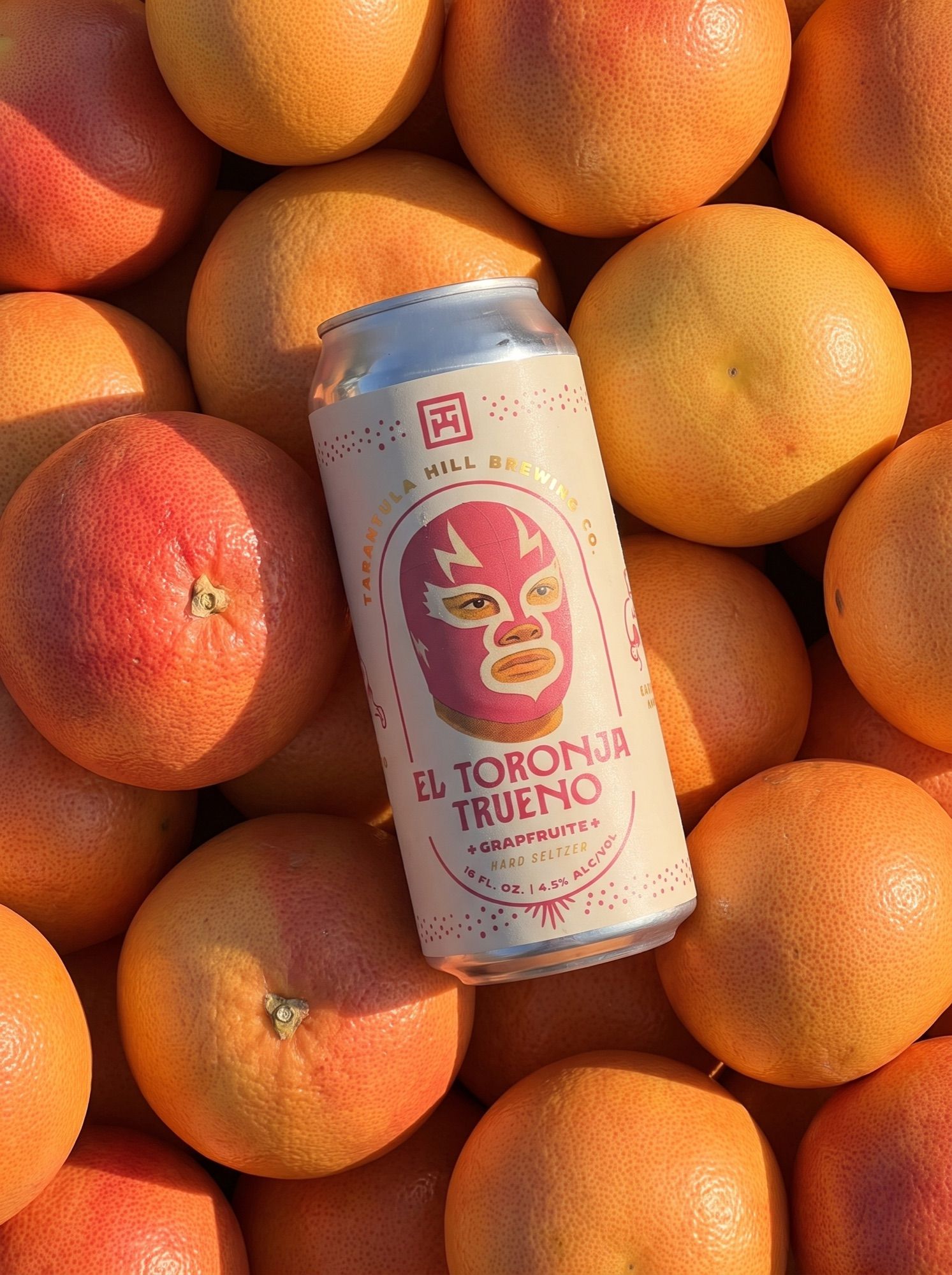
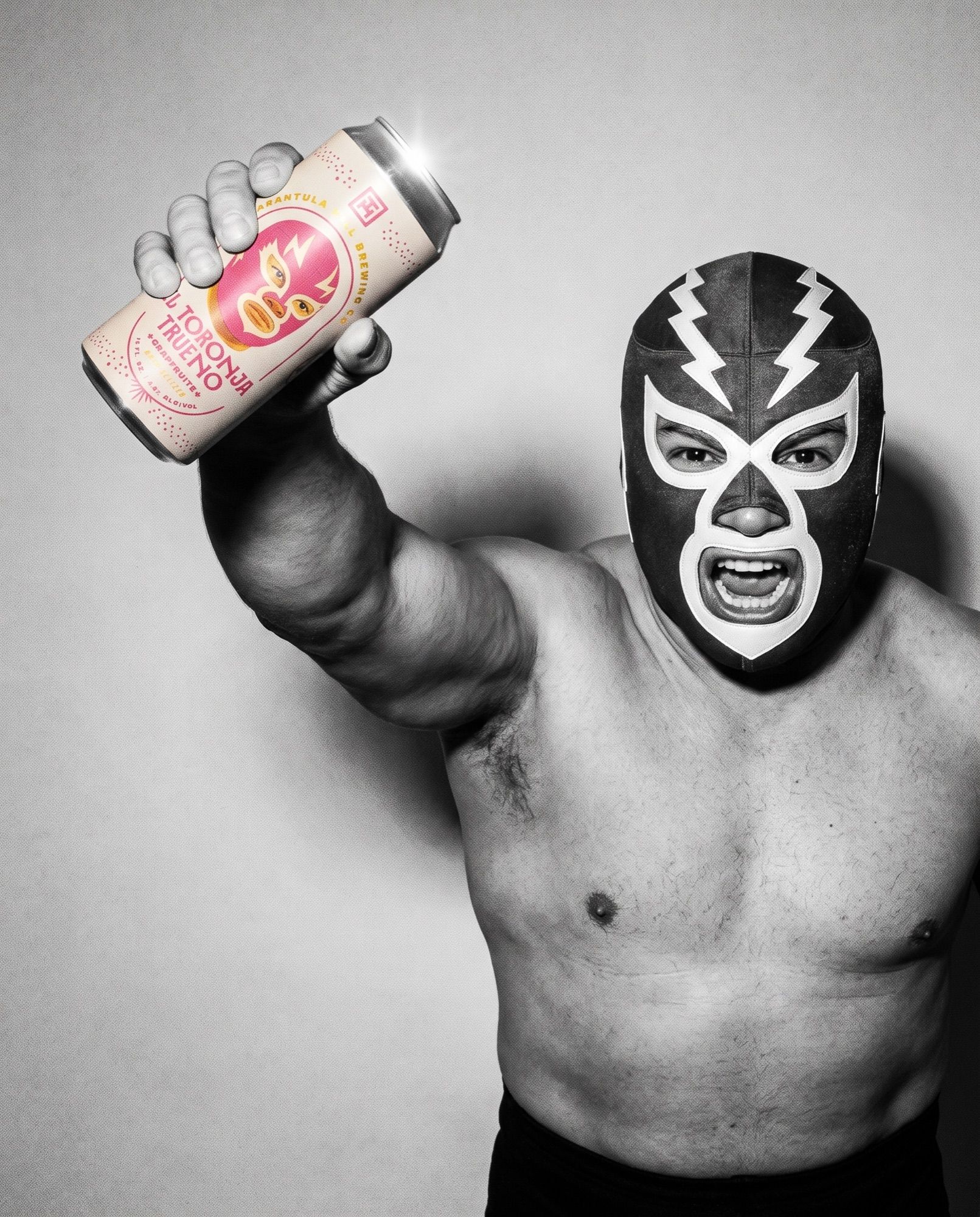
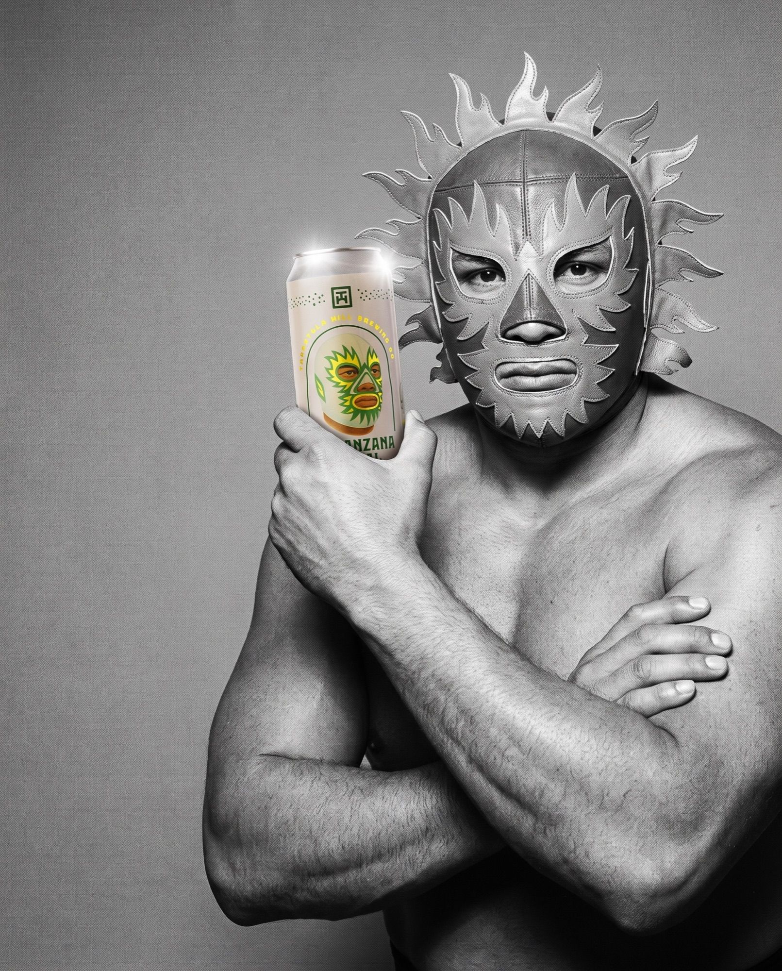
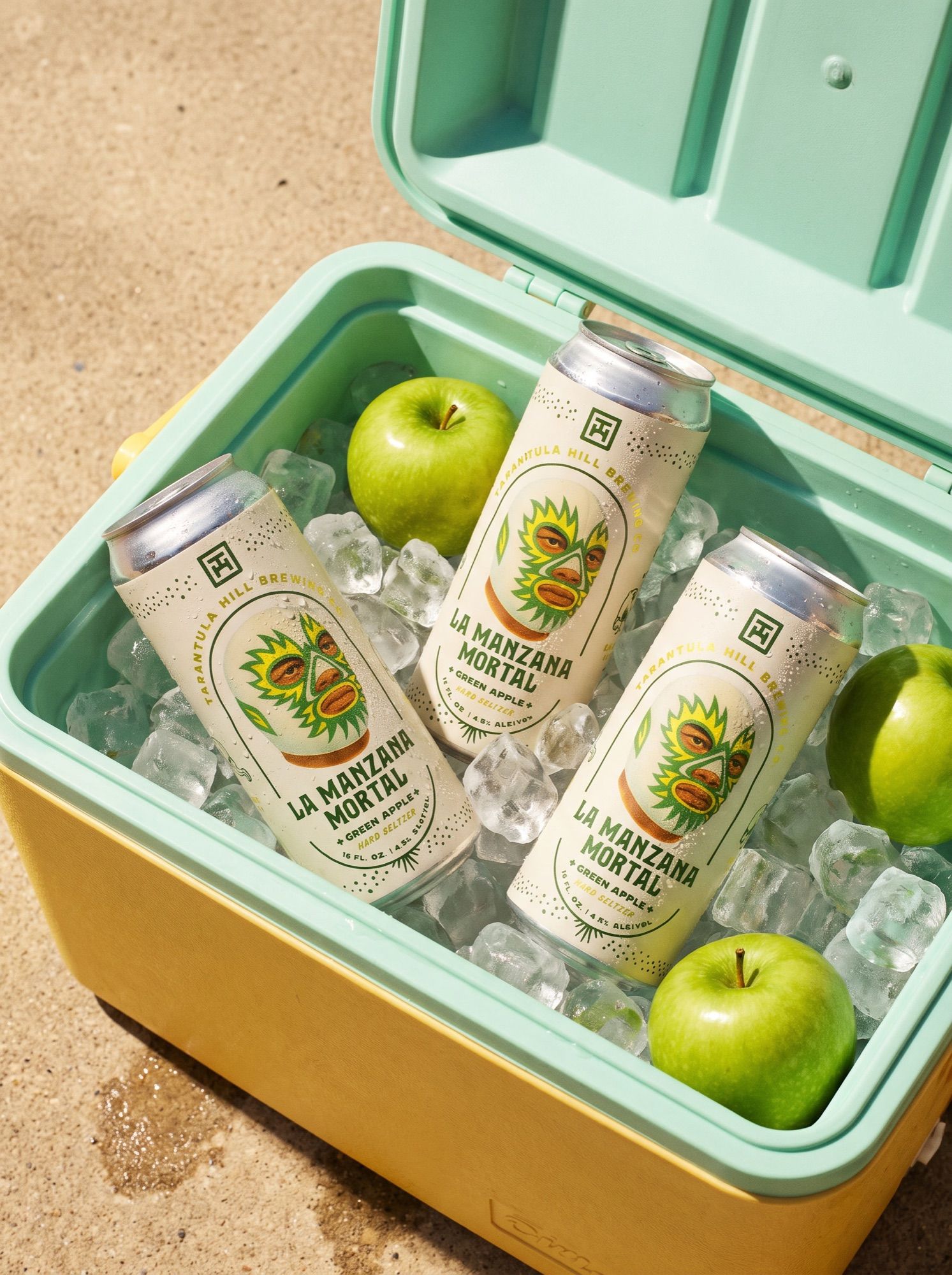
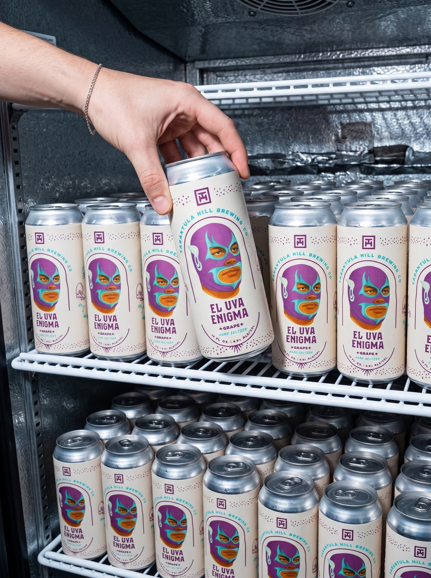
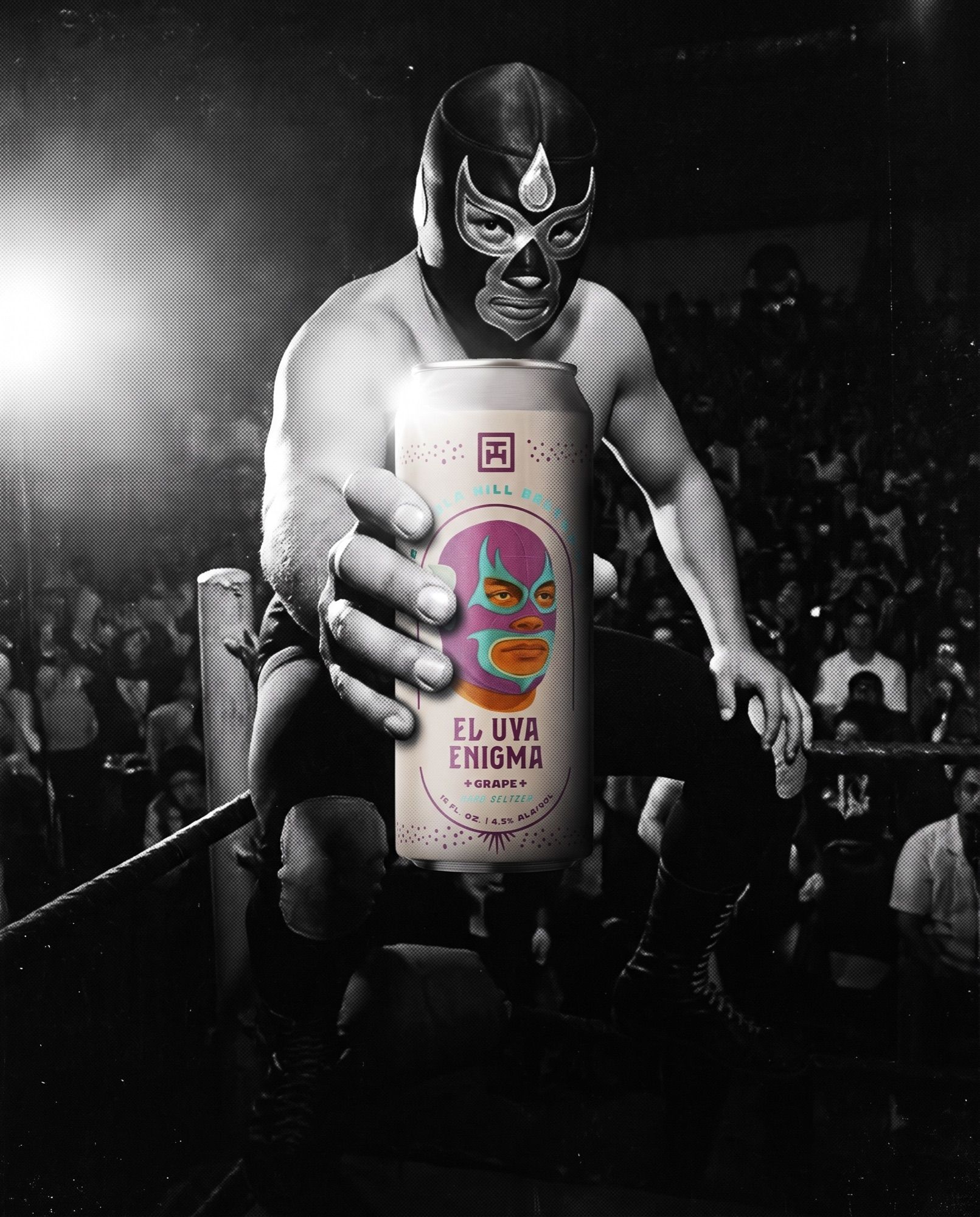
I created the Seltzer Series from the can up. Each flavor is fronted by its own masked luchador — La Manzana Mortal, El Uva Enigma, El Toronja Trueno — on a shared cream can with flavor-coded color, so the three read as one lineup on shelf and as rivals on their own. From there I built the campaign around the ring: vintage wrestler imagery, a “The Fiercest” call sign and a line for every flavor, carried through out-of-home, social and product photography.
What I did
Campaign concept, can design, marketing assets, social assets and product photography.
*Campaign *Packaging *Marketing *Social *Photography
Credits
Creative Direction
Joshua Serrano